BACKGROUND: Roberto Vanin a wine loving Italian scientist, came to us with a patent for a unique methodology of creating non-alcoholic drinks, where unlike other low or non-alcoholic drinks -which are first made with alcohol and then de-alcoholised (resulting in a loss of flavour), this technology ensures the alcohol is kept out in the first place. A drink made for a sophisticated palate, without any added sugars or sweeteners. Unusually brand name BOLLE came out of the first stage design concepts.
BRIEF: Create a sparkling non-alcoholic brand and packaging that reflects the sophisticated nature of this product.
CREATIVE SOLUTION: A bold memorable combined expression of 'non-alcoholic’ O% alcohol and ‘bolle’ (bubbles in Italian) delivered with modern Italian styling.
RESULTS: Launched at the London wine 2022 and all-ready generating lots of press and attention.
DISCIPLINES: Brand Design, Packaging, Website, Gift Boxes / Cards, Ads / Posters on/offline, Art Direction
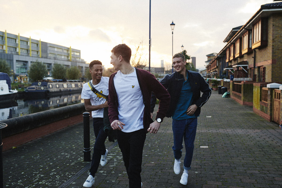
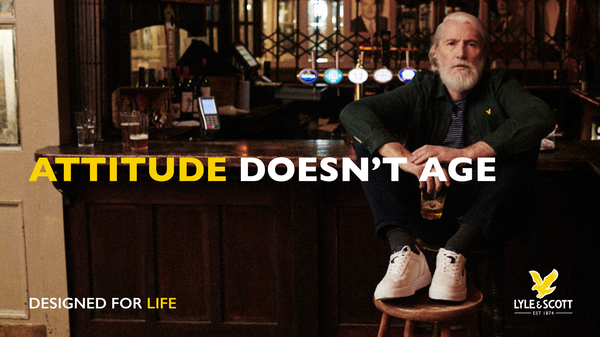
BACKGROUND: Lyle & Scott were on the cusp of reaching out to a wider global audience. The brand had a strong heritage and great products, but marketing had been produced on a ‘as and when needed’ basis, resulting in an incoherent brand and an inconsistent tone of voice.
BRIEF: Pull the brand concept together and create a unified structure for all communications.
CREATIVE SOLUTION: Strong confident copy, typography and image styling.
RESULTS: Marked efficiency and respect for the design process amongst the team, elevating the brand’s positioning to be in-line with the quality of their products.
DISCIPLINES: Brand Design (Graphic + Typographic use), Brand Architecture, Sub-Brands, Brand Guidelines, Gift Boxes / Cards, Ads / Posters on/offline, Art Direction
BACKGROUND: With a Royal Warrant and a client list to die for, Fisher were looking to expand their portfolio to position themselves as ‘THE’ people for all events.
BRIEF: To take their existing recognised brand identity and modernise it, so that it exudes confidence.
CREATIVE SOLUTION: By re-designing and Fisher’s identity, we added dynamism, a palette of colours and a solution that works across their social media platforms.
RESULTS: Fisher went from being the best in the business to being known to be the best in the business.
DISCIPLINES: Brand Identity, Brand Guidelines, Stationery, T-Shirts, Livery, Creative Direction of the website.
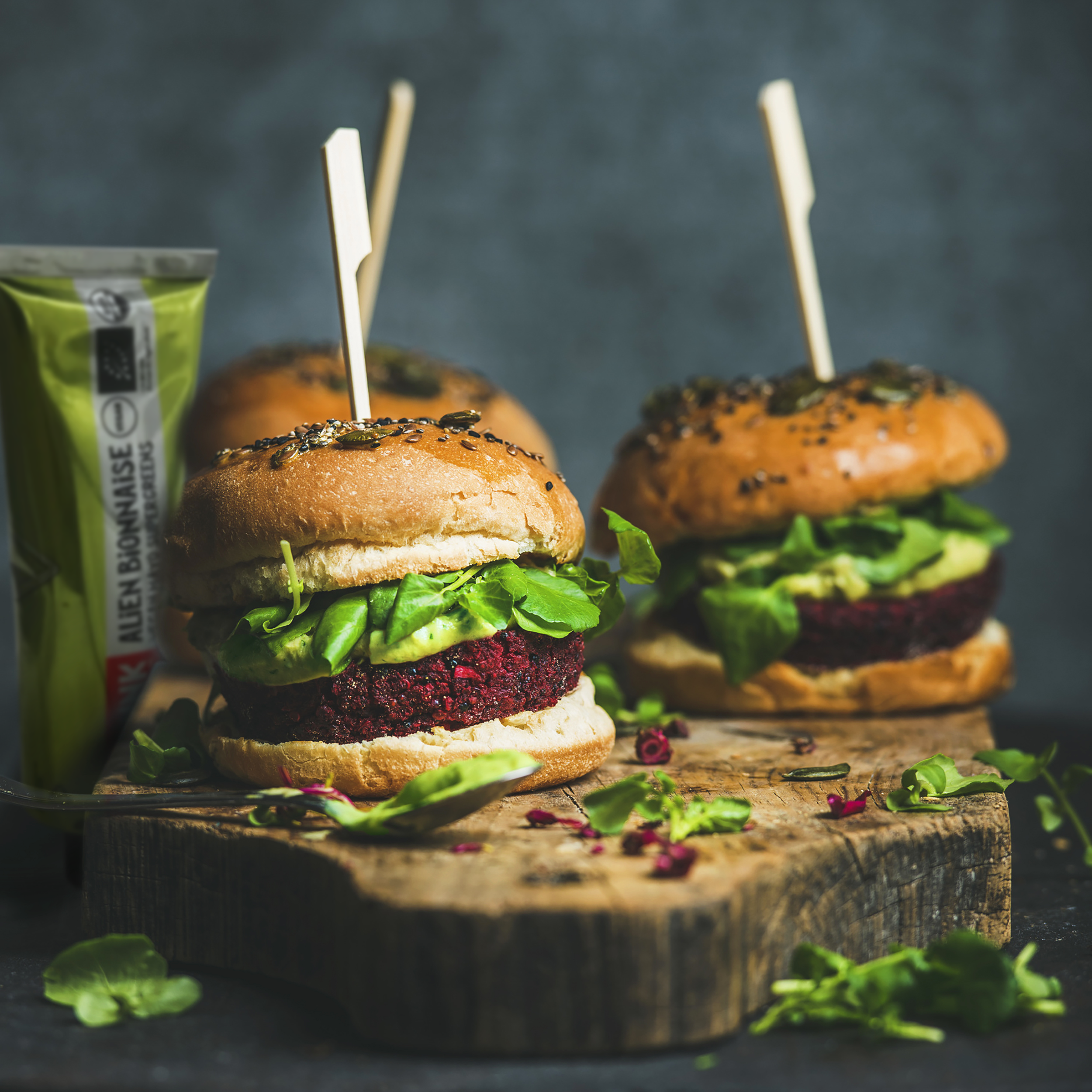
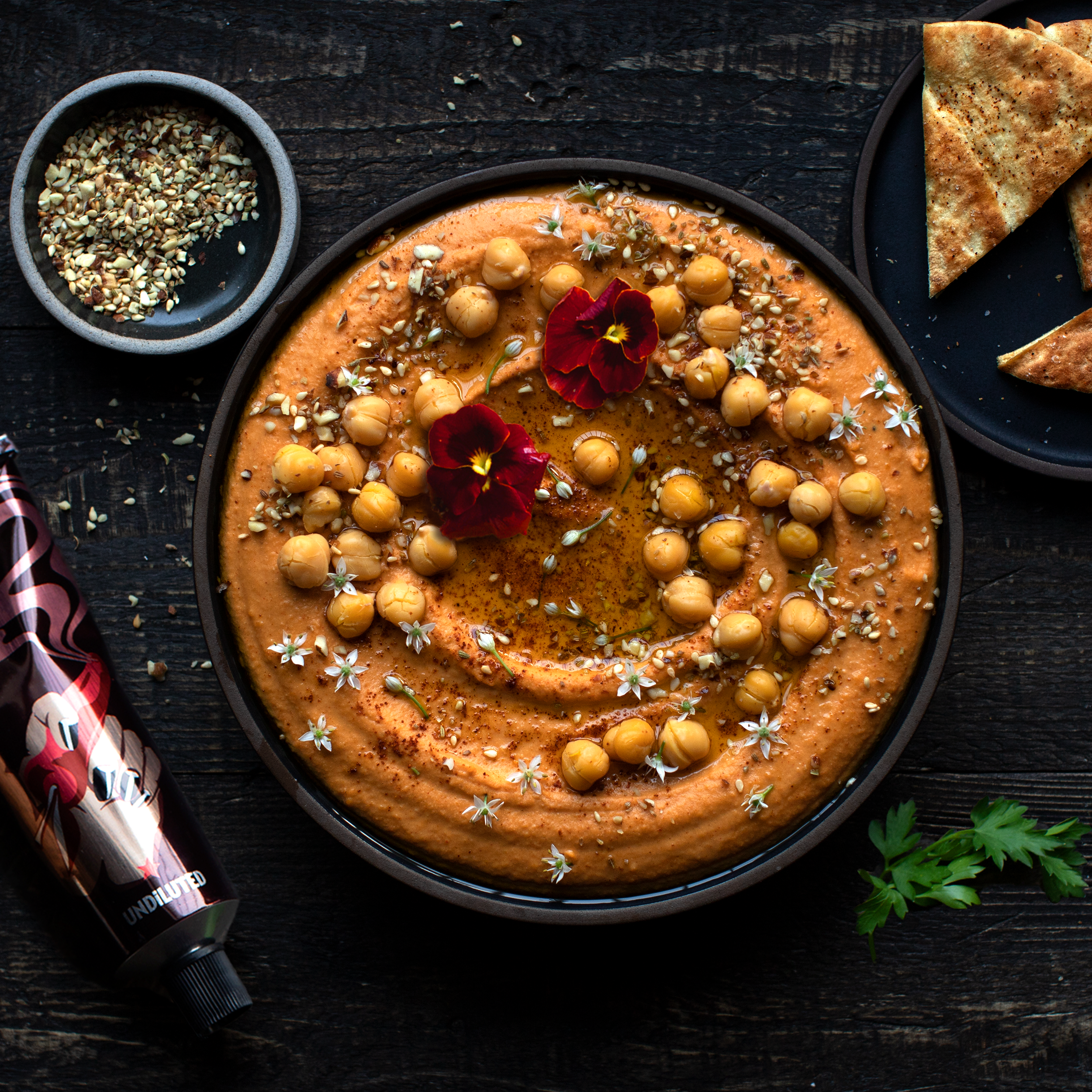
BACKGROUND: We worked alongside Richard to first develop Entube; the pre-cursor to Hlthpunk, a kitchen ingredients brand. We then developed the Hlthpunk brand from scratch
We want people to enjoy... HEALTHY, INSANELY TASTY, PLANET-FRIENDLY FOOD, WITH A DIFFERENCE. In the same way we did when we were growing up. This is food we're passionate about and truly believe in.
BRIEF: Create a brand that is bigger than any condiment. One that celebrates art, culture and the planet.
CREATIVE SOLUTION: Being true to their love of art and culture, we created a handcrafted font and unique illustration style that set us apart from the competition. We like to say #EatWHatUBelieve.
RESULTS: Where to start? 5 Indigo design awards, and 1 year later Hlthpunk is stocked in numerous stores around the world. Wholefoods (USA, UK), Selfridges (UK), Harvey Nichols (UK), Bon Marché (FR), KaDaWe (DE), The Westin Josun (SK), Hyundai (SK), AlJereez (ME)… and generated a lot of social chatter from the likes of Steph Shepherd (1.6m), Jessica Alba (1.8m), Milano Alyssa (2.9m), Vashtie Kola (0.4m); just some of the celebrities talking about us. We’ve been called ‘the Brew Dog of condiments.’
DISCIPLINES: Branding, Packaging, Naming, Image Styling and everything else in-between.
BACKGROUND: The Child's Farm toiletries brand initially created Farmologie as a go-to product for mothers who had experienced the benefits of Child’s Farm sensitive skin products on their children and wanted some for themselves! Child's Farm soon realised there was a wider, younger audience that wanted the same quality products for their sensitive skin.
BRIEF: Re-create the Farmologie brand so that it speaks to the Gen Z crowd.
CREATIVE SOLUTION: The insight, ‘sensitive skin doesn’t have to be boring’ and Child’s Farm philosophy, ‘be confident in your skin’ led us to create a simple, bold brand and pack design that stands out on the shelf with its vibrant neon colours, brought to life through creative brand imagery.
RESULTS: A successfully re-positioned brand identity with stand-out packaging design. Project completed to deadline and within budget, and snapped up by Superdrug.
DISCIPLINES: Brand Identity, Image Styling, Packaging, Packaging Guidelines.
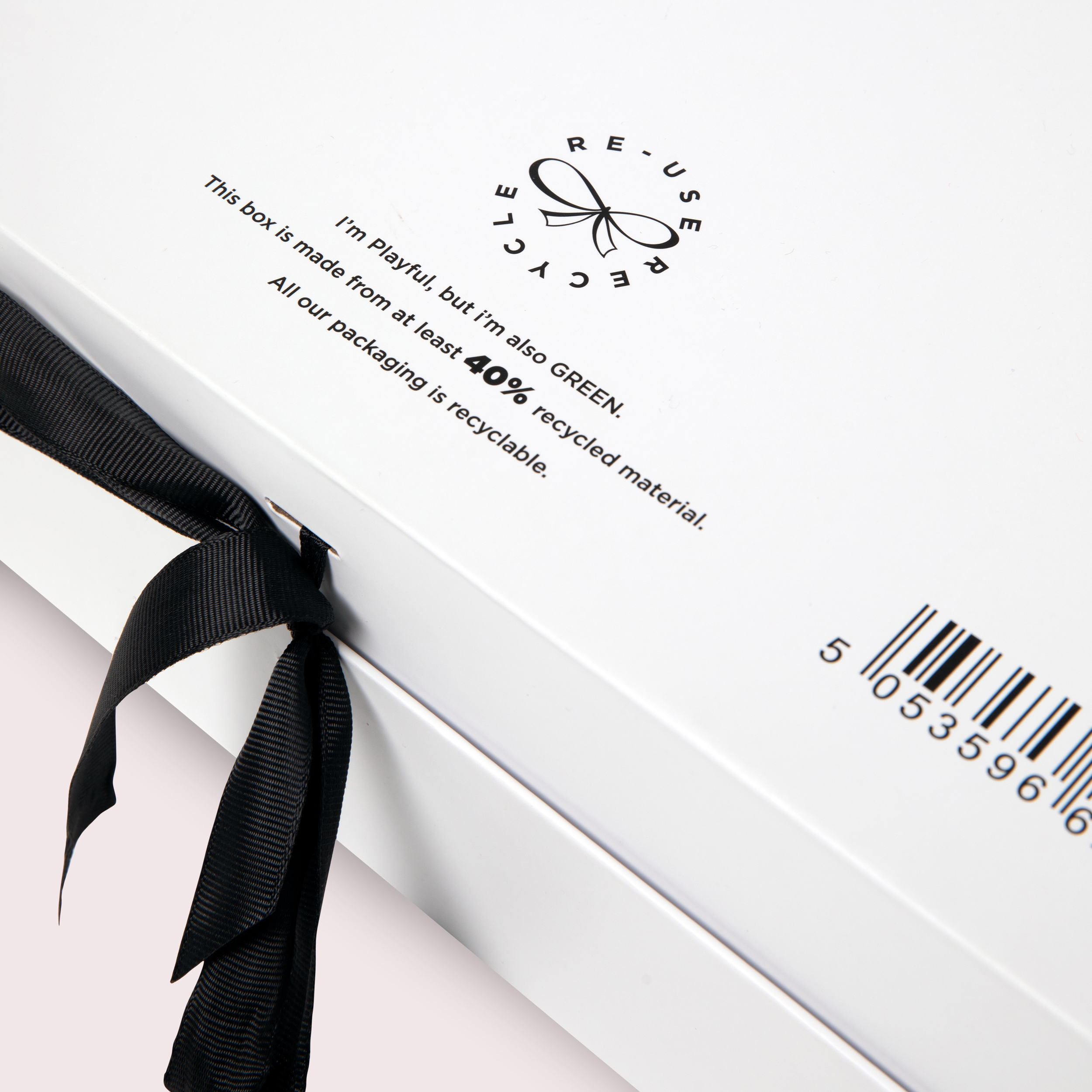
BACKGROUND: Founded by Emma Parker in 2004, Playful Promises has become a worldwide portal for buying lingerie and bras of all shapes and sizes. As they say ‘Feel nice, feel naughty, but always #FeelPlayful’
BRIEF: Design an e-commerce box and gift box solution that reflects Playful Promises ‘Mischievous, sexy, pretty or practical, but never boring and beige’ positioning.
CREATIVE SOLUTION: Taking the essence of what Playful Promises USP, we came up with a playful illustrative solution, enhanced with the ribbon bow, that could be used in various guises.
RESULTS: Working with the manufacturer, we created an ultimate lingerie gifting solution that was 100% recyclable and brought to life their USP.
DISCIPLINES: Illustration briefing & liaison, 3D and 2D Packaging design
'We enjoyed working on our new packaging with Laurence and his team. They came up with 3 pretty cool concepts, that we then moved forward and developed one from. The good thing is because they created artwork as part of this project, we've been able to use it in other branding exercises like on notebooks for customer free gifts etc which enhanced the value for money of the project'.
Emma Parker - Playful Promises MD
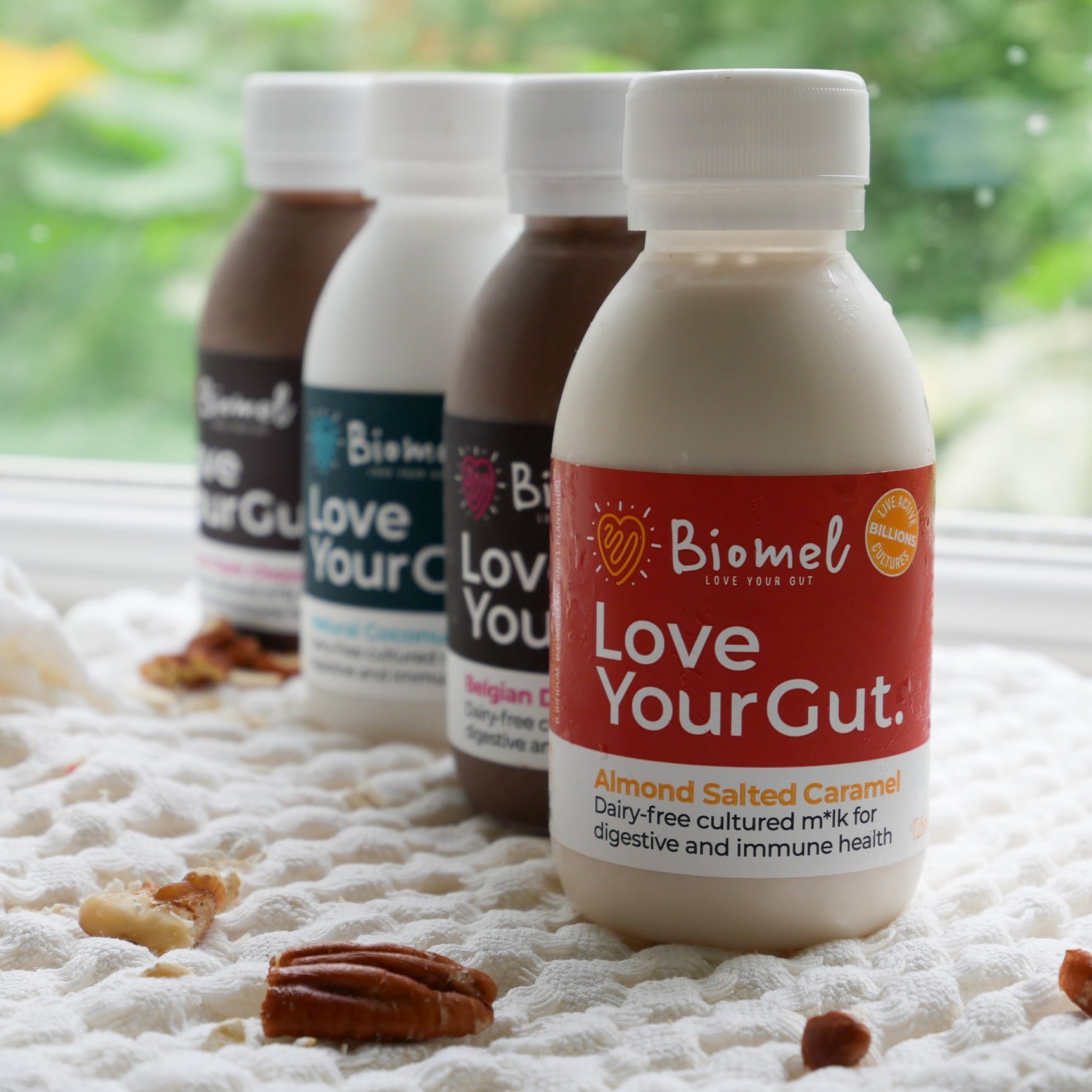
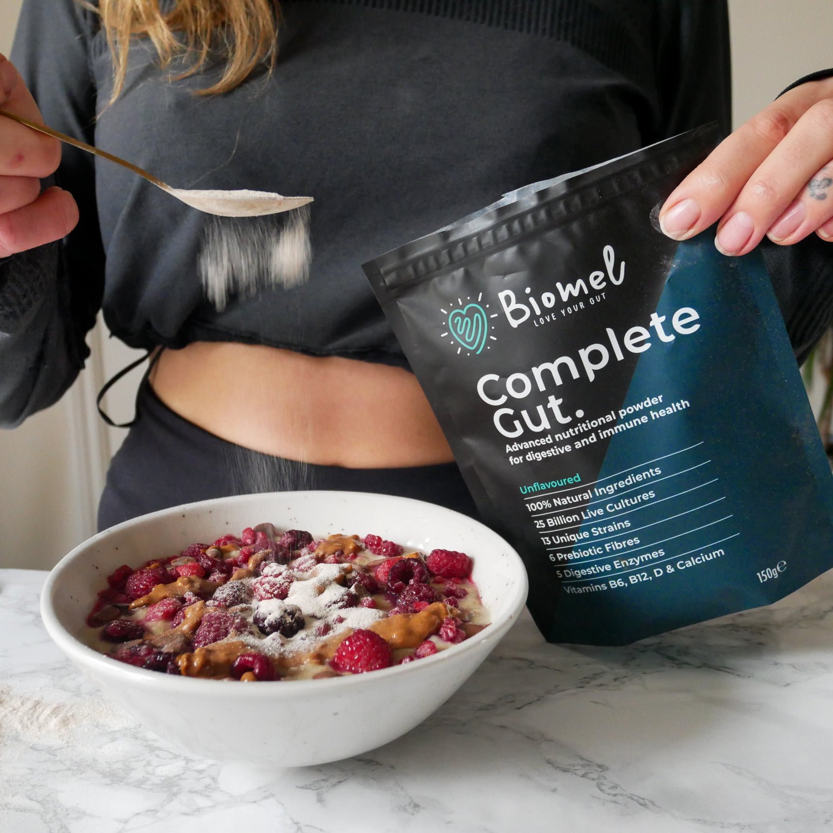
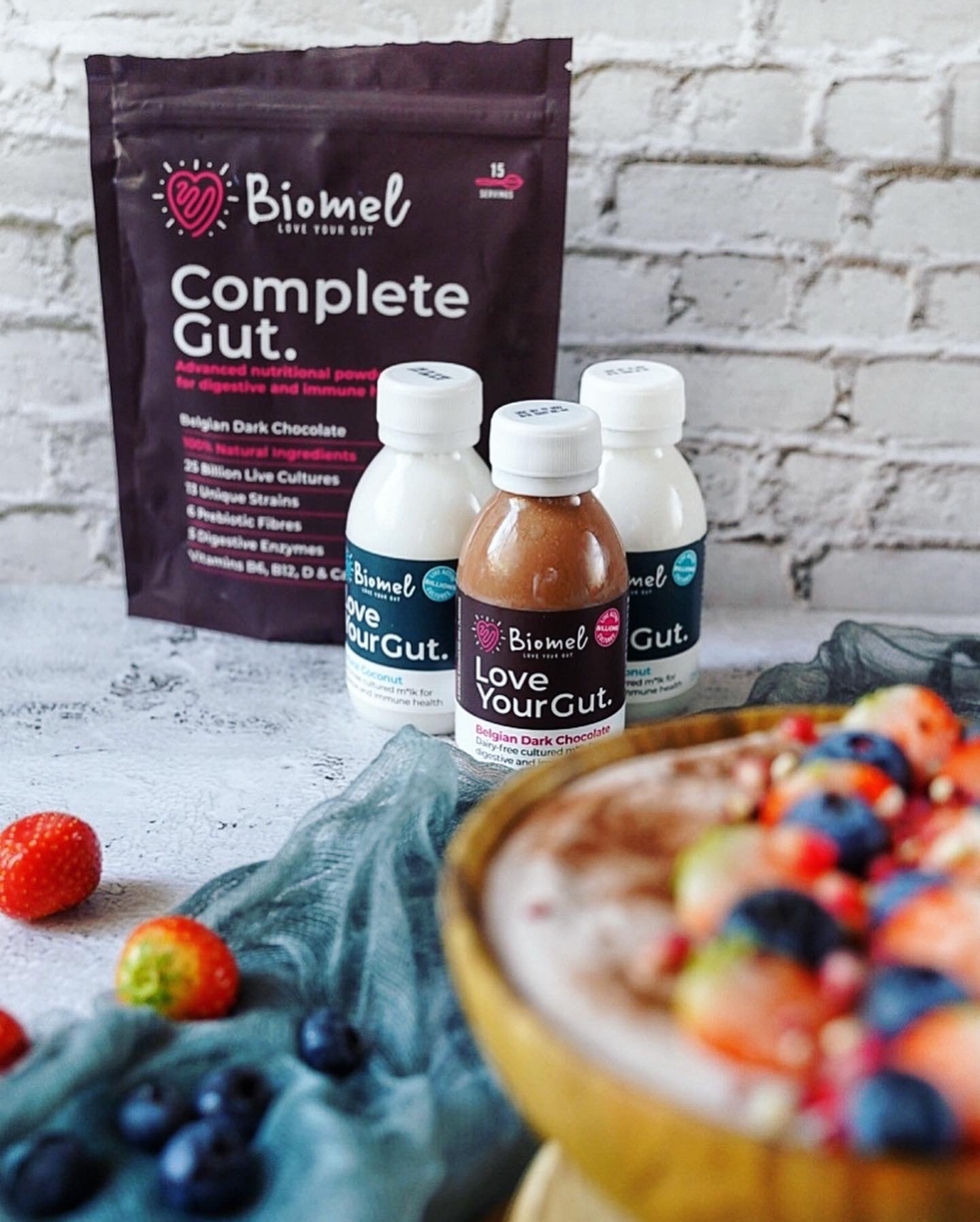
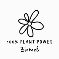
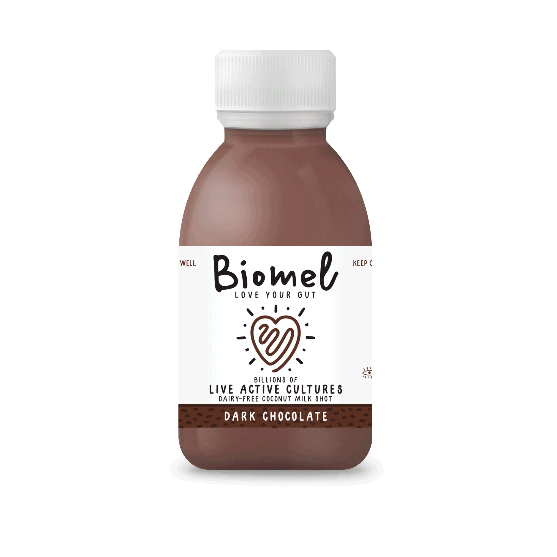
BACKGROUND: Start up Gut Health Drink – Est. 2018.
BRIEF: Create a contemporary go-to brand for gut health drinks.
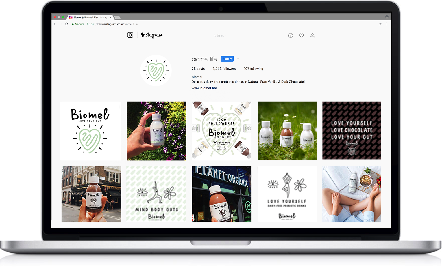
CREATIVE SOLUTION: The ‘gut’ in a heart shape reads Love Your Gut. An icon that’s now synonymous with gut health. Simple and memorable. Over the past few years we have worked closely with the founder and the team, constantly tweaking and refining the brand, whilst developing new products concepts as well as a rebrand in-between…
RESULTS: Biomel has become the UK’s fastest growing Active Health Drink.* Achieving 1,000% growth rate over its 1st year and is now in over 3,000 stores such as, Waitrose, Selfridges, Boots, M&S Sainsbury’s, WholeFoods and Planet Organic, Dunnes and Holland & Barrett.
*Source: The Grocer
DISCIPLINES: Brand identity, Logo, Packaging, NPD, Exhibitions, Posters / Ads, Web / Social Banners, Stationary.
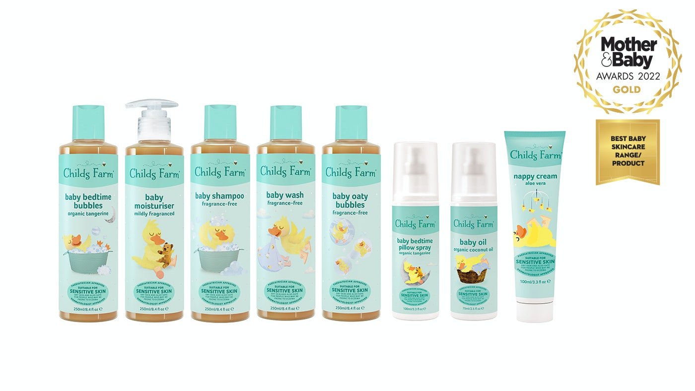
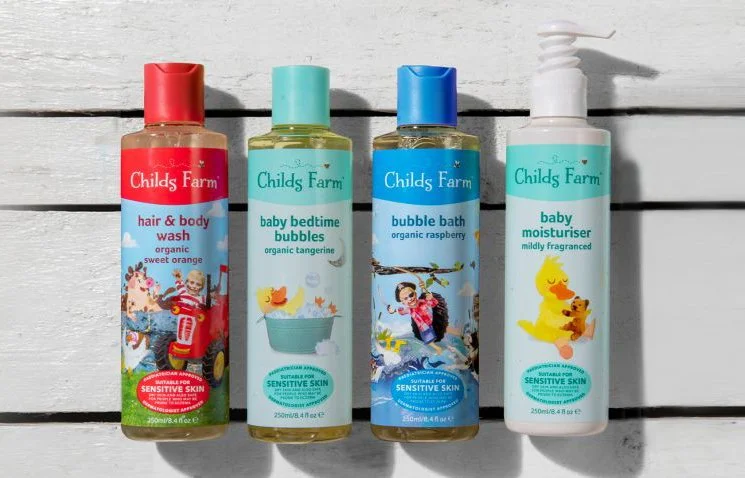
BACKGROUND: Child's Farm came to us to create some clarity on-pack whilst retaining their unique illustration style, and extend their range.
BRIEF: Create a contemporary and evolutionary re-design of the Child’s farm packaging, and create clarity and consistency in its messaging.
CREATIVE SOLUTION: Take off any unnecessary clutter off the front and back of pack and create a system for the logo, graphics, typography, icons, and colours that ensures consistency across the range.
RESULTS: Working with the in-house design team, we designed a system and implemented it across over 60 SKUs
DISCIPLINES: Packaging, illustration, packaging guidelines, Information hierarchy, range extension.
BACKGROUND: A new Italian jewellery company, predominantly sold online, with a flair for modern design using precious metals and jewels.
BRIEF: Create a logo that can be used for packaging, and jewellery that express Orovi’s flair for modern Italian design.
CREATIVE SOLUTION: Playing with the letter forms we created a modern memorable mark where the R and V embrace the precious ‘O’ like a ring seen from above.
RESULTS: Orovi is one of Amazon’s top sellers in its European markets.
DISCIPLINES: Logo, Packaging, Brand Video, Photography styling, Amazon shop page.
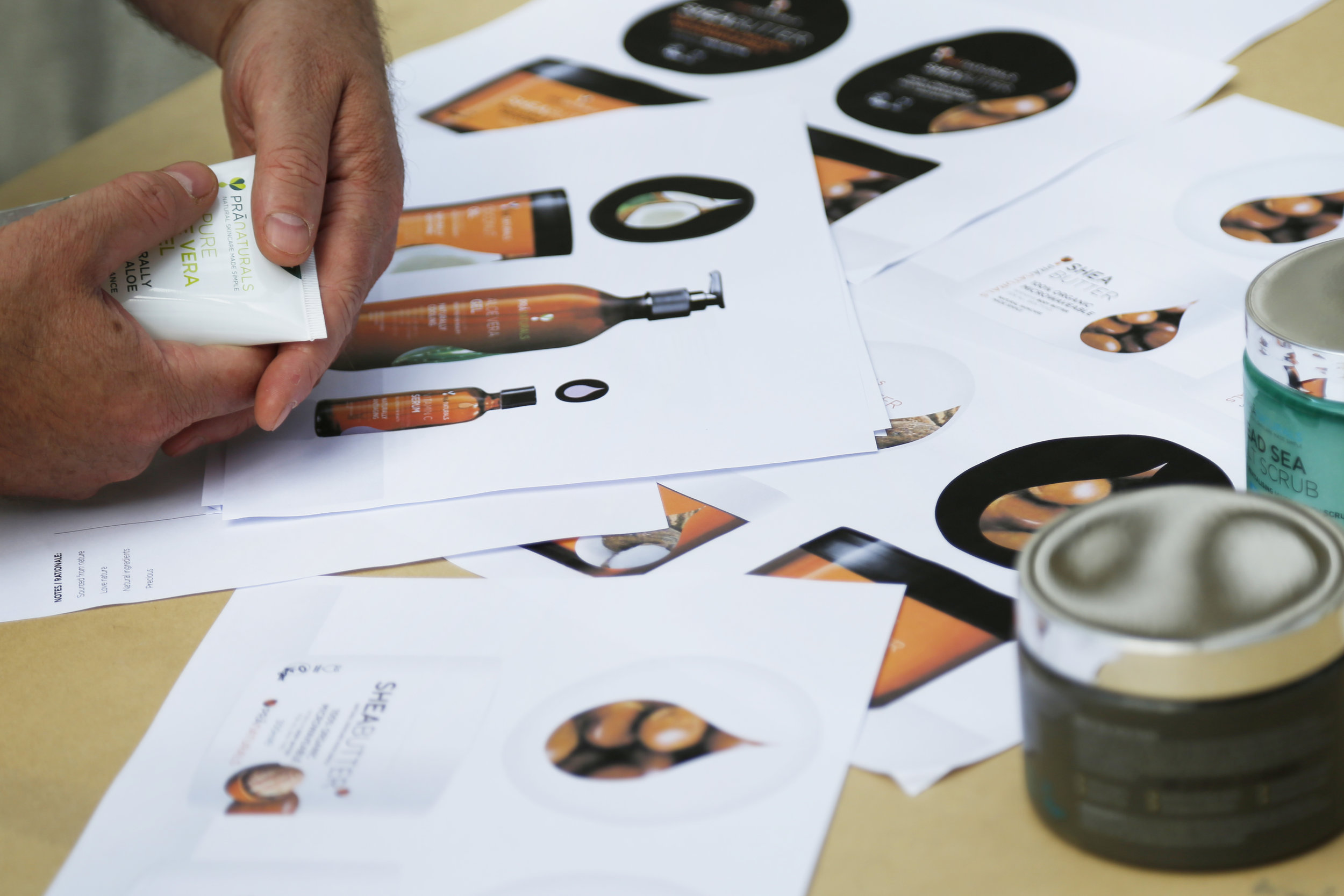
BACKGROUND: Just Beauty, the on-line beauty platform, saw that organic, natural, pure and ethically-sourced products were gaining traction and wanted a piece of the action.
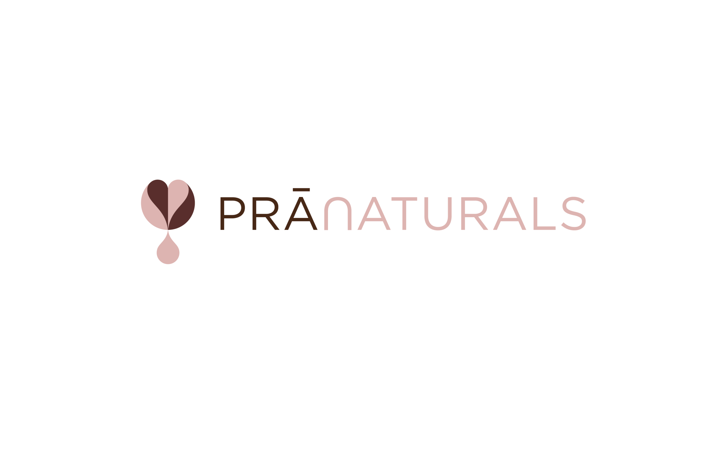
BRIEF: Create the brand mark for a range of organic, natural, pure and ethically sourced beauty products, ‘as nature intended.’
CREATIVE SOLUTION: Simplicity and purity were key in creating a memorable shorthand for the brand to stand out on-shelf and on-line. We created the leaf / heart / drop icon that summed up the brief in 1 memorable mark.
RESULTS: PraNaturals went from an initial range of 4 products to over 25 in 1 year.
DISCIPLINES: Brand design.
BACKGROUND: Z-ZOOM specialises in creating high quality and stylish reading glasses for fashion conscious customers on their travels (it not just the over 50’s that need them!).
BRIEF: Create a confident reading glasses brand that appeals to all age groups, for travel retail and online sales.
CREATIVE SOLUTION: Frames to zero in on... The two eyes in the word Zoom was too much of a gift not to add the glasses.
RESULTS: Z-Zoom if now firmly established internationally online.
DISCIPLINES: Brand Identity and Naming.
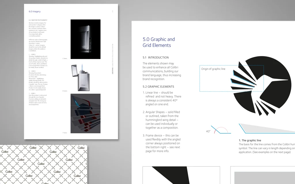
BACKGROUND: Founded in 1928, Colibri grew from humble origins in an East London workshop into a globally successful brand. But by the 1990s the brand’s fortunes had taken a turn. The present owners acquired the business in 2009 with the aim of recreating the brand as a holistic lifestyle business fit for the future.
BRIEF: Resurrecting an icon. A complete re-brand from head to toe (Brand, Marketing + Products). Moving Colibri from being an outdated lighter business to a relevant modern cigar and men’s accessory brand. To build a team to take care of the entire branding spectrum – managing all design work, creating the product itself and marketing to distributors and end customers.
CREATIVE SOLUTION: We were keen to respect the brands heritage and liaised closely with the founder's family to unearth hidden secrets of the brand. Snippets of which helped us as we developed the Identity, brand story, guidelines and design philosophy – all centred on the Art Deco heritage of Colibri and its quirky Viennese founder Julius Lowenthal. A huge undertaking across three product ranges.
RESULTS: A vastly improved relationship with buyers and an ongoing partnership based on supporting their needs at retail. Sales increased by 30% in the first 2 months alone. Colibri is once again a thriving brand.
DISCIPLINES: Brand Identity, Product strategy + implementation, Product design, Styling and Design, Naming, Packaging, Trade Show design, Poster design, Advertising, Image Styling, copy styling, manufacture co-ordination (China, Europe), website design + build.
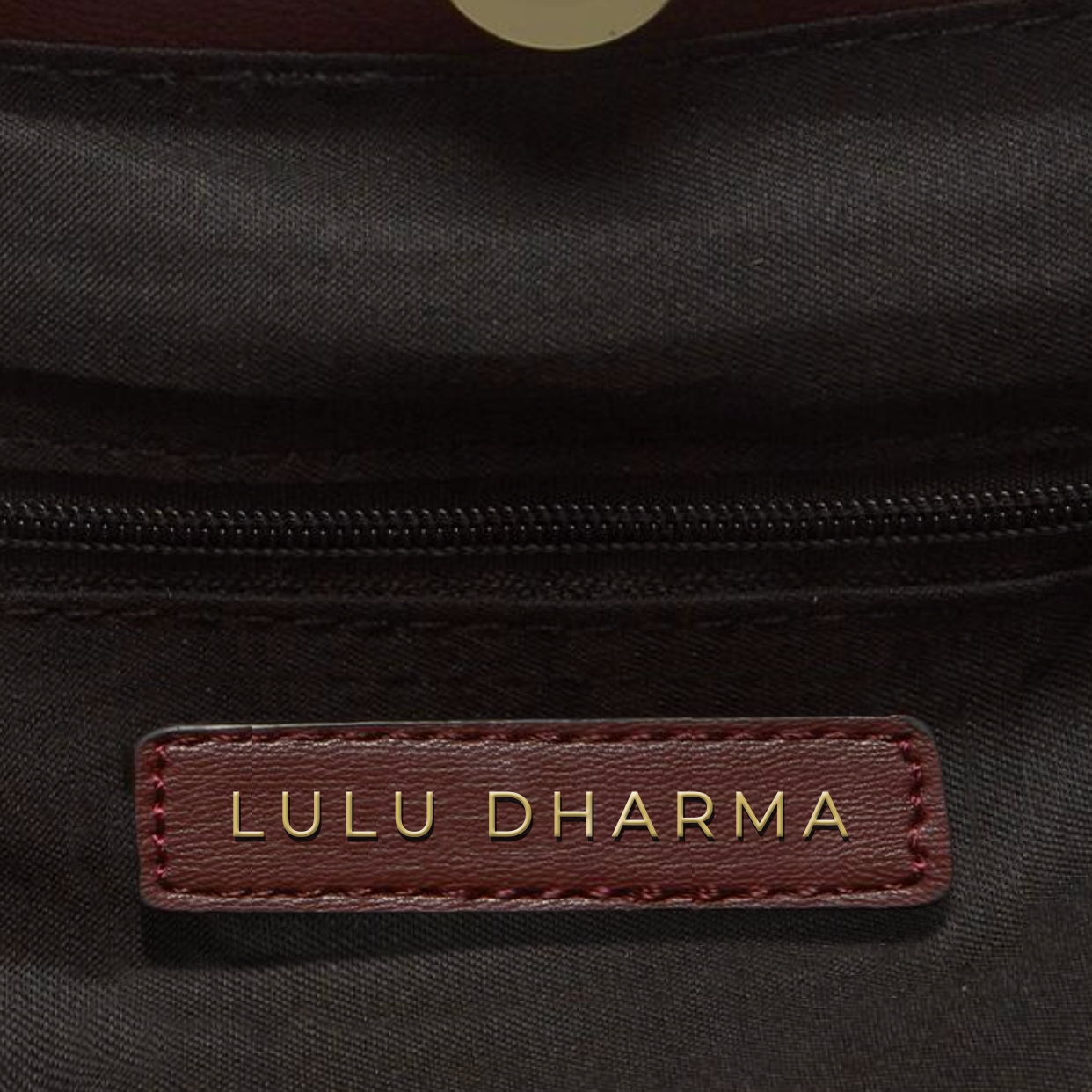
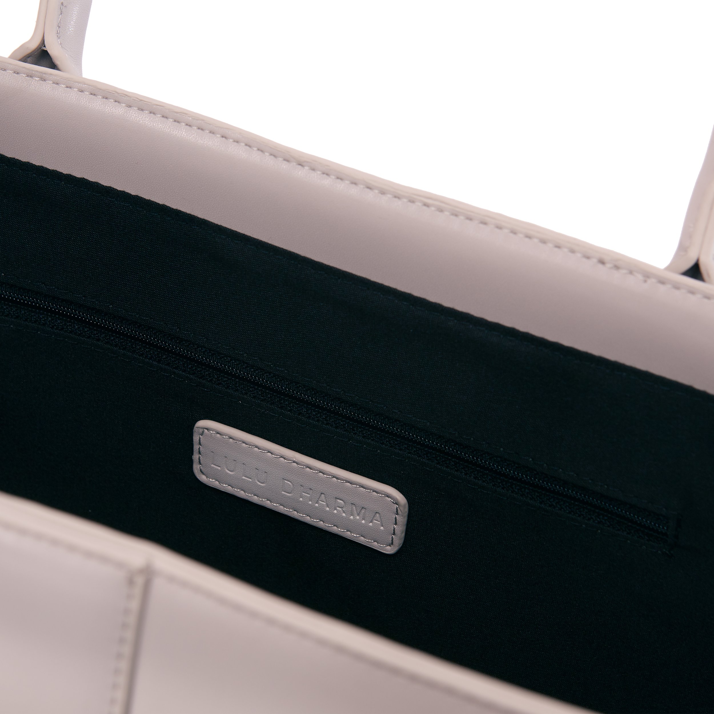
BACKGROUND: Moving from jewellery to Bags and Accessories - Lulu Dharma needed to transition into a more of sophisticated , lifestyle brand that expressed the founders spiritual and ethical undertones.
BRIEF: Create a sophisticated identity that expresses the companies spiritual and ethical stance and one that is easy to apply onto their products.
CREATIVE SOLUTION: Updating and bringing in a level of sophistication with the lettering and bringing the L looping into moon of the D of Lulu Dharma, added that distinguished element as a shorthand, that could be replicated both large and small and embossed out of vegan leather or the metal buckles.
RESULTS: Along with the new products and new brand Lulu Dhama has extended their customer base from 5,000 to over 35,000 regular customers, as well as recently becoming one of “Oprah’s Favourite Things’
DISCIPLINES: Logo, Packaging, Brand Guidelines.
BACKGROUND: Innovation consultancy specialising in the development and commercialisation of emerging technologies.
BRIEF: Capture the essence of phoenix ventures in a minimalistic contemporary manor.
CREATIVE SOLUTION: We incorporated the positive concept of phoenix –emerging / rising sun into the brand name, adding a touch of flare – underpinned by the more rational Ventures text.
RESULTS: A simple – easy to use brand with a distinctive shorthand.
DISCIPLINES: Logo + Colour palette.