Teaming up with my brother Richard, who works out of LA with a background in the music and entertainment business, we created a brand for a new food concept.
With many family trips to Provence food has been a centrepiece of both our lives and, as sons of artists, mealtimes have always been a colourful array of local flavours and ingredients.
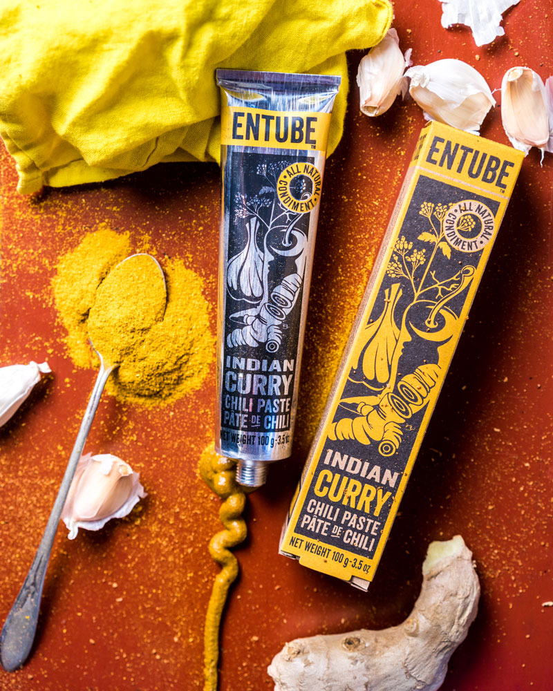
The mission for Entube was to help people experiment with creating delicious, healthy food and bring the beauty of colour to the table. With print and fine arts in mind, the traditional oil paint tube became an inspiration for the brand.
The Entube design reflects the craft and care of a product made from all natural ingredients. Designed to fit in Wholefoods and independent delis as well as online sales. It is an evolving design process to get the best results on shelf and on-line. A collaboration in design.
The project included brand identity, packaging design, illustration, copywriting, gifting and point of sale.
Entube was Speciality Food Finalist in the coveted SOFI Awards in 2016.
My client had ambitious plans to design a new watch brand, from scratch, for the Global Travel Retail market.
Everything was needed: brand creation, positioning, naming, brand identity, product design, packaging, sales materials, photography, manuals, warranty cards, point of sale and web look and feel. A full brand world.
The only stipulation: that it be firmly rooted in the heart of London.
I undertook a brand positioning and naming exercise looking for gaps in the market.
Shoreditch fit with the desire for a contemporary feel, underpinned by British craft and detailing. The district has a rich legacy in design: Clerkenwell for watchmaking, Hackney shoe-making and Brick Lane brewing. Shoreditch is where London’s history and the innovative worlds of modern art, design and technology come together.
Overseeing the whole design and branding process I liaised directly with the best watch manufacturers. Supplying them with technical drawings and pushed for the highest standards of production. Every detail of the range was designed right down to the union flag motif on the winding crown, the engraved Shoreditch triangle on the back and the stitch details on the straps. I managed all the prototyping and signed of production samples in collaboration with the client.
Shoreditch is not just another brand marque. It was designed in the district, under exacting standards and with a unique character to appeal to travellers world-wide.
Working with 3rd generation diamond dealers from Antwerp Laurence was briefed to create an elegant, new jewellery brand. The family has workshops in India and Spain and were keen to grow into new online markets across Western Europe.
Laurence collaborated with internationally renowned calligrapher Peter Horridge to create a memorable identity. Threading a necklace through the O of the wordmark to create a striking monogramed M that became a repeat pattern across packaging.
Laurence worked with the client and Amazon to create the brand pages, and on-line marketing collateral which has seen it succeed across France, Germany, Italy, Spain and UK.