


/
1
2
3
4
5
6
7
8
·
·
·
·
·
·
·
·
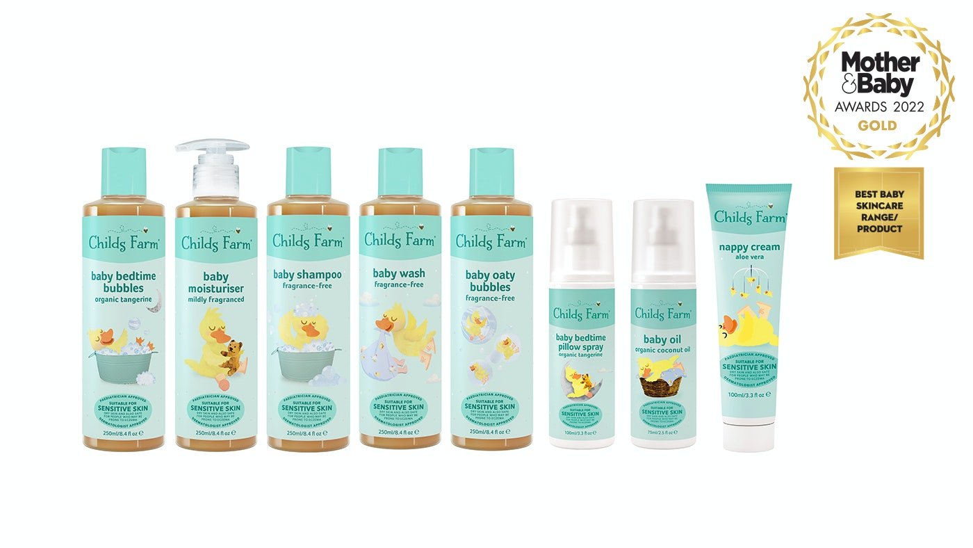
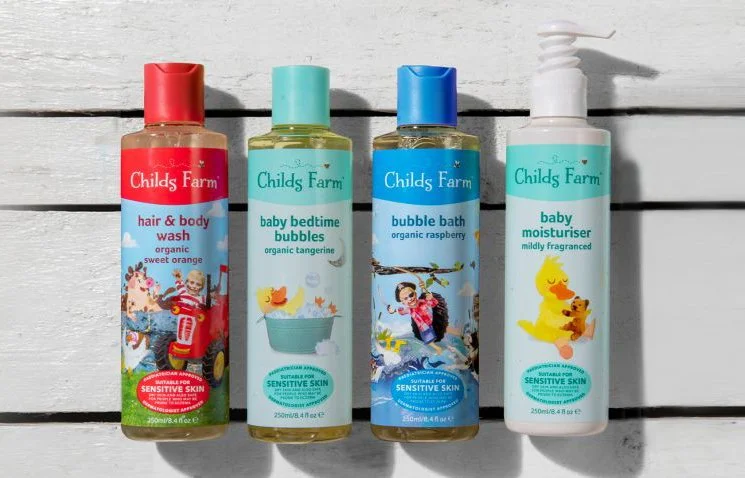
BACKGROUND: Childs Farm asked us to create clarity and consistency in their packaging whilst retaining their unique illustration style, in order to extend their range.
BRIEF: Create a contemporary and evolutionary re-design of the Childs Farm packaging, with clarity and consistency in its messaging.
CREATIVE SOLUTION: Remove any unnecessary clutter from the front and back of pack and create a system for the logo, graphics, typography, icons, and colours that ensures consistency across the range.
RESULTS: Working with the in-house design team, we designed a system and implemented it across over 60 SKUs (Stock Keeping Units).
DISCIPLINES: Packaging, Illustration, Packaging Guidelines, Information Hierarchy, Range Extension.